Components for the next phase
Why we are raising this
We built six pages of the proposed site structure — Home, the three Technology pages, and two Company pages — using only the components the live site already has. The point was not to design anything. It was to find out whether the current components can carry the deeper content the next phase needs, before anyone commits to a structure and starts writing to it.
For the most part it cannot, and the reasons are consistent enough to be worth setting out properly.
None of this is a criticism of the site as it stands. The current site does the job it was built for. It is a short sequence of statements, each one filling the screen, read top to bottom in a minute, and it does that well. The new content asks something different. For example, 'Export control' and 'Who we are' are documents — a five-part list of regimes, a founder's account six paragraphs long in the first person, accreditations, a safety case. Same components, a different kind of reading.
Where the current set falls short
There are two separate problems with two separate solutions.
No vertical rhythm
Each component decides its own vertical space, and none of them knows what sits above or below it. Two of the components used most often — the text-and-image and advantages components — set a minimum height of one full screen. The three-column component sets no vertical padding at all.
So the spacing of a page is a by-product of which components happen to sit next to each other. Put two full-height components in a row and the page fills with empty space; put two unpadded ones together and they are squashed together. On the homepage, where the components alternate and there are only a few of them, this never shows. On a content page of six components it shows repeatedly, and it is the main reason our prototype pages feel broken rather than merely plain.
It is only the order of components that stops the layout breaking.
That matters beyond how the pages look. It means the pages cannot safely be reordered or extended. An editor moving one component, or adding a paragraph's worth of content in a new one, can produce a page that has to be re-sequenced by hand to look right. The more pages the site has, and the more people edit them, the more often that will happen.
What we would want is an outcome, not a method: spacing that is consistent and does not depend on the order components appear in, and no component setting its own screen-height minimum. How that is best achieved inside your build is your team's call — we have not seen the front-end, only what it renders. We can show how we did it in our prototypes if that is useful.
Four missing component shapes
These are the gaps in the component set. Each one is a shape that appears repeatedly in the new content and has nothing in the current set to put it in.
A plain text component
A left-aligned block of rich-text copy. It is the simplest component on the list and the most useful, because it goes anywhere: running text between two other components, a minimal, text-only banner at the top of a page, a short passage that needs no picture. At the moment the only way to place straight copy is the text-and-image component, which then leaves an image slot with nothing to fill it. There is a plain text component in the system, but it belongs to the news article type, and we do not think it is practically available on these pages.

A repeating list
An uncapped list of items, each with a term and a description. The current three-column component is fixed at three, so the five export-control regimes had to be split across two components — one list presented as two, with no way for a reader to see it is one. The same component covers a dated timeline and any general heading-and-body list, which is why we are asking for one component here rather than three.
A row of figures
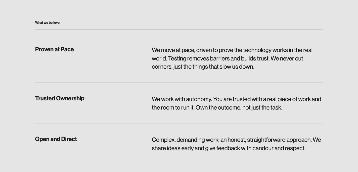
Mach 6+, 300km+, nine months. 80%+, years to months. Seventy-five people, two countries, €123m+. Three of these rows appear across the six pages, and each time we had to invert the three-column component to build one — putting the figure where the body goes and the label where the heading goes, so the number came out larger than its caption. It works visually and it is upside down underneath. A row of figures should be its own component, with the figure being given both visual and semantic weight.
A generic call to action
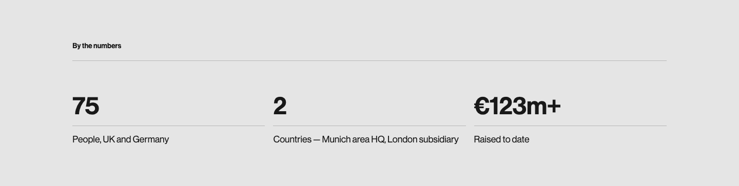
There is currently no option for a generic call to action at the end of most pages. The existing contact component, used on the Careers page, is built around a named contact person. Every deep page needs the option of a proper 'next step' action to close, and this is the component that does it.
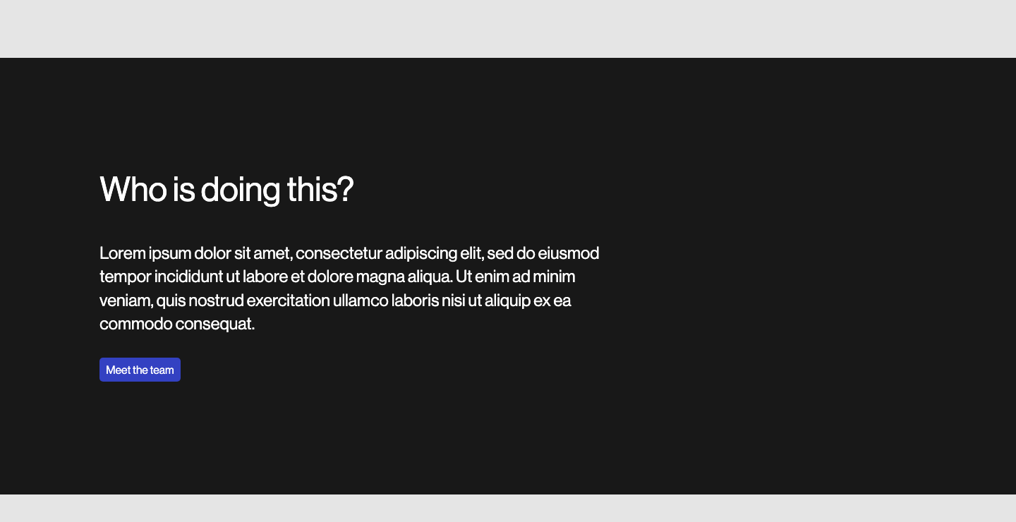
On the Careers prototype the closing CTA has a background image with the content overlaying it. The contrast is what makes the component feel like the conclusion. Where there is no photograph, the component can paint a dark ground instead and get the same effect — which matters most on the light Company pages, where a close in the page's own colour simply trails off.
Implementation
We are assuming each of these is a new component, to be implemented in both the backend and frontend systems. From what we can see of the CMS, components carry content fields only, with no layout or variant configuration. If variants are cheaper in your stack than that suggests, the same four shapes could potentially arrive as options on fewer components.
What we left out
There is room for more components than these, with narrower jobs, and we considered several. A promo group is the clearest example — three claims with a heading and a line each, like 'Sovereign by design' or 'What we believe'. We left it out because the existing three-column component does that job well enough once the spacing and the typography are dealt with. We have kept the recommendation deliberately short: four shapes that between them cover as much of the new content as possible, rather than a component for every case that came up. Narrower components are easier to argue for once these four are in place and there is a working page to judge them against.
Heading hierarchy
The current components set their main heading small and bold above a rule, with the line beneath it large and light. In the context the site was designed for, that works. Each component carries one statement, and the heading is a label on it rather than something a reader navigates by.
On deeper pages that changes. When a reader is scanning five or six components to find the part they want, the headings are what they scan, and at present the headings are the smallest text in the component. We are not recommending a change now, only that it is looked at again after the spacing work, since denser pages will make the difference more obvious than the prototypes do.
How colour themes are set
Each component on the site carries a colour theme — dark, light, blue — covering both its background and the text and other foreground elements on it. We cannot tell from the outside where that is decided, and nothing in the Strapi CMS content fields appears to control it.
It turned out to matter less than we expected. We had varied the component themes across our prototype pages, but not for design reasons: three text-and-image components in a row on one theme were repetitive and left a lot of empty space, and the alternating colours were doing work the spacing should have been doing. Given a proper rhythm (and some additional components) the colour differences are not needed. The rebuilt page runs on its own theme throughout and makes one deliberate change, the dark CTA that ends the page.
So the question is a narrow one: where is a component's theme set, and does an editor get any say in it?
The demonstration
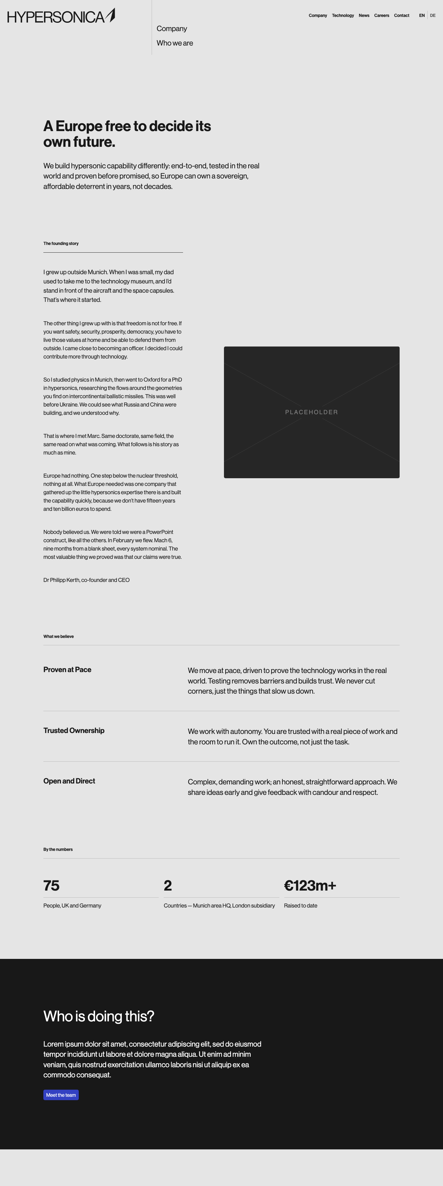
'Who we are' has been rebuilt. The same content, in five components: the opening statement as a plain text component, the founding story as text and image, the three values as a repeating list, the figures as a row of figures, and a call to action where the 'Where next' routes were. The existing version is untouched beside it, so the two can be read one after the other.
See the rebuilt page See the original
Nothing on the rebuilt page sets its own height, and no component carries its own vertical padding. The spacing comes from one rule applied from the outside. That is the outcome, not a method we are asking you to adopt.